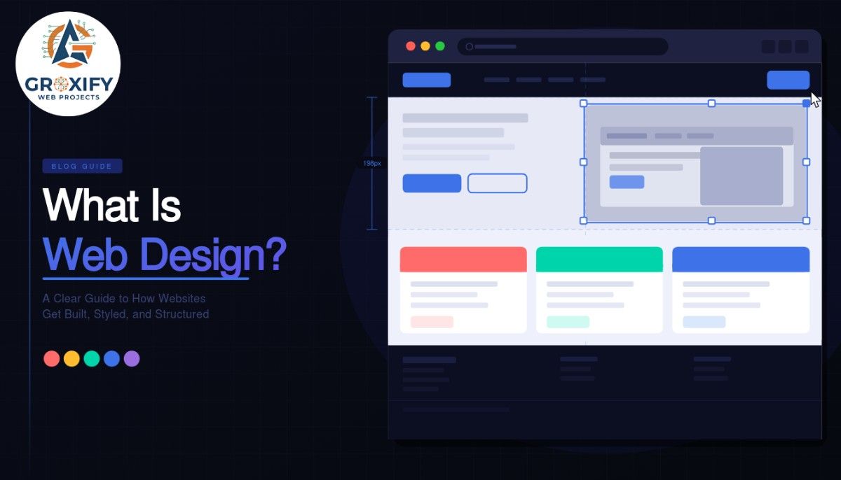
What Is Web Design? A Clear Guide to How Websites Get Built, Styled, and Structured
Someone lands on a website. Within three seconds, they either stay or leave. They do not read the code behind it. They do not check which platform it runs on. They just feel it. And that feeling is web design at work. Web design is the process of planning and creating everything a visitor sees and interacts with on a website. That includes the layout, colors, fonts, images, buttons, and how all of it fits together. This article covers what web design actually means, what its key elements are, how it differs from web development, and how to figure out what you actually need for your situation. What Is Web Design and What Does It Actually Cover? Web design is the discipline of creating the visual and functional experience of a website. It is not just about making things look nice. It is about making things work for the person using them. Think of it like designing a physical shop. The way products are placed, how easy it is to find the billing counter, whether the lighting feels welcoming, all of that is design. A website works the same way. Every choice, from where a button sits to what color it is, shapes how a visitor feels and what they do next. A well-designed website does not just look good. It helps visitors accomplish what they came to do, faster and with less friction. That is the whole game. The Core Elements of Web Design Knowing the name is one thing. Understanding what each element actually does in practice is where most explanations stop short. So here is each one, explained plainly. Layout Layout is how content is arranged on a page. It decides what a visitor sees first, what they notice second, and where their eye travels from there. A good layout creates a natural reading path without the visitor even noticing it is happening. The most common approach is the grid system, where content is organized in columns and rows to keep things visually aligned. Bad layout makes a page feel cluttered or confusing. Good layout makes a page feel effortless. Typography Typography refers to fonts and how text is presented on screen. This includes font style, size, line spacing, and how headings differ from body text. Typography affects readability more than most people expect. Text that is too small makes users squint. Too many different font styles make a page feel chaotic. A clean, consistent font system signals that the site is trustworthy and thought through. Color Color is not decoration. It is communication. Colors create mood, guide attention, and carry meaning. Red can suggest urgency. Blue tends to signal trust. Green often connects to health or growth. Web designers build a color palette, meaning a set of two to four colors that work together consistently across the entire site. A good palette is accessible (readable by people with color vision differences) and aligned with what the brand is actually trying to communicate. Images and Visual Content Images, icons, illustrations, and videos are all part of web design. They break up text, show what words cannot, and often create the first emotional response a visitor has before they read a single sentence. The choice of visuals matters a lot. Generic stock photos make a site feel hollow. Real, specific imagery makes it feel genuine. Icons and illustrations, when done well, make navigation faster and more intuitive. Navigation Navigation is how users move through a website. This includes the main menu, footer links, breadcrumbs (those small trails showing where a user is on the site, like Home > Blog > Article), and call-to-action buttons. Poor navigation is the fastest way to lose a visitor. If someone cannot find what they need in a few clicks, they leave. Good navigation is simple, predictable, and consistent across every single page. White Space White space, also called negative space, is the intentional empty area between elements on a page. It sounds minor. It is not. Crowded pages feel stressful to look at. Pages with breathing room feel premium and easy to read. White space is part of why certain well-known tech websites feel expensive before you even read what they are selling. Types of Web Design Not all websites are built using the same approach. The type of design used depends on the site’s purpose, its audience, and the devices it needs to work on. Responsive Web Design Responsive design means the website automatically adjusts its layout based on the screen size being used. On a desktop it might show three columns. On a phone, it stacks into one. The layout responds to the device. This is the most widely used approach currently because the majority of web traffic comes from mobile devices. A site that is not responsive will look broken on phones and will also rank lower in Google search results. Adaptive Web Design Adaptive design creates separate, fixed layouts for specific screen sizes. Instead of one layout that stretches and shrinks fluidly, there are multiple versions, and the site detects which one to show the visitor. It gives designers more precise control, but requires significantly more design and development work. Responsive design is the standard for most websites. Adaptive design is used in specific cases where that extra control genuinely matters. Static Web Design A static website has fixed pages. The content does not change unless someone manually goes in and updates the files. These sites are fast, simple, and work well for portfolios, landing pages, or small informational sites. Dynamic Web Design A dynamic website pulls content from a database and can show different things to different users or update automatically. E-commerce stores, news websites, and any platform with user accounts are dynamic. The design interacts with live data to create a constantly changing experience. What Does a Web Designer Actually Do Day to Day? Most explanations of web design skip this entirely. Here is what the actual work looks like. A web designer typically starts
What Is Web Design? A Clear Guide to How Websites Get Built, Styled, and Structured Read More »