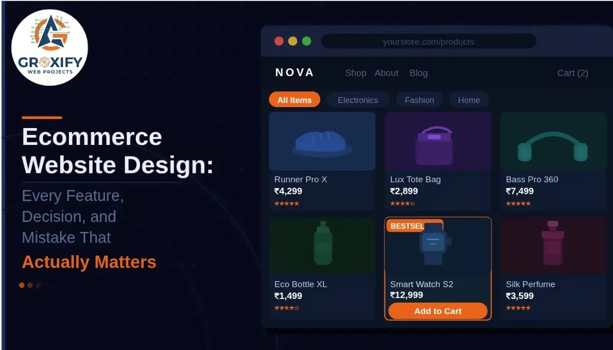
Ecommerce Website Design: Every Feature, Decision, and Mistake That Actually Matters
Most people building an online store spend weeks picking colors and fonts. Then they launch, get some traffic, and wonder why nobody is buying. The design looked fine. So what went wrong? Good ecommerce website design is not about looking pretty. It is about removing every reason a visitor might hesitate, doubt, or leave. Every decision, from your homepage layout to your checkout button color, either builds confidence or quietly kills it. This article covers the features that actually matter, the mistakes that cost you sales, how to choose the right builder or template, and what the best ecommerce sites consistently do that others miss. By the end, you will know exactly what to build and why. What Good Ecommerce Website Design Actually Means Design, in ecommerce, is not just how a website looks. It is how it works, how fast it loads, how easy it is to buy something, and how safe a visitor feels handing over their payment details. Think of it like a physical store. If it is messy, you leave. If you cannot find anything, you leave. If no one seems trustworthy, you leave. Ecommerce website design solves those same problems, just online. The goal is not to impress. The goal is to remove friction. Friction is anything that slows a visitor down or makes them second-guess a purchase. Every design choice either reduces friction or adds to it. That is the lens through which every decision in this article should be read. Must-Have Features Every Ecommerce Website Needs Some features are optional. These are not. If your store is missing any of them, you are leaving money on the table no matter how much you spend on ads or search rankings. A Homepage That Directs, Not Just Decorates Your homepage is not a brochure. It is a traffic director. A visitor lands there and needs to immediately understand three things: what you sell, who it is for, and what to do next. A strong hero section, which is the large visual banner at the very top of your page, with one clear call-to-action button does more than a homepage packed with sliders, popups, and animated elements competing for attention. Keep it focused. Direct people where they need to go. Product Pages That Do the Work of a Salesperson This is where most stores actually lose customers, not the homepage. A product page needs to answer every question a visitor has before they think to ask it. That means high-quality images from multiple angles, a description that addresses real purchase concerns (not just a list of specs), visible pricing, clear stock status, and an obvious “Add to Cart” button above the fold. Above the fold means visible on screen without scrolling. Reviews belong here too. User-generated reviews, meaning real feedback from actual buyers, build trust faster than any product copy you write yourself. Do not hide them at the bottom. A Checkout That Does Not Fight the Customer Cart abandonment rate is the percentage of shoppers who add something to their cart and then leave without completing the purchase. Research consistently puts this number around 70 percent. A complicated or confusing checkout is one of the biggest reasons. Keep checkout to as few steps as possible. Always offer guest checkout so people do not have to create an account before buying. Show a progress indicator so they know how close they are to done. Display security badges, which are SSL certificate icons and payment logos, clearly on the page. And never reveal unexpected shipping costs at the last step. That is one of the fastest ways to lose a sale. Site Search That Actually Works If your store has more than 20 products, search is not optional. A visitor who types something into your search bar is already motivated to buy. If your search returns irrelevant results or nothing at all, they go somewhere else. Good site search includes autocomplete, which means suggestions that appear as someone types, along with filters for category, price, size, color, or whatever fits your product range. This is basic functionality that pays for itself. Mobile Design Built First, Not Retrofitted More than half of all ecommerce traffic currently comes from mobile devices. If your site is designed for desktop and “also works on mobile,” that is not enough anymore. Buttons need to be large enough to tap accurately. Text must be readable without pinching and zooming. Images need to load quickly on mobile connections. Responsive design, which means your site automatically adjusts its layout to fit any screen size, is the minimum standard. The best stores think through the mobile experience separately rather than just shrinking the desktop version down. Ecommerce Website Builder vs Custom Design: Which One Do You Actually Need This is one of the first big decisions a new store owner faces and one where a lot of people overthink it. The honest answer is: most businesses do not need a custom-built site. Ecommerce website builder like Shopify, WooCommerce, Wix, and Squarespace cover the vast majority of what a small to medium store needs. They handle hosting (where your site’s files live and run online), security updates, payment processing integrations, and performance automatically. You focus on your products and customers, not servers and code. Here is a straightforward comparison: Builder (Shopify, Wix, etc.) Custom Development Starting cost Low to moderate monthly fee High upfront investment Time to launch Days to a few weeks Weeks to several months Technical skill needed Minimal High, or hire a developer Design flexibility Good enough for most stores Unlimited Ongoing maintenance Handled by the platform Your responsibility Best suited for Most businesses Enterprise or very specific needs Custom development makes sense when you need specific functionality that no builder supports, or when you are operating at a scale where monthly platform fees become more expensive than owning your own system. For most people reading this, a builder is the right and faster path. How to Choose Ecommerce Website Templates Without Wasting
Ecommerce Website Design: Every Feature, Decision, and Mistake That Actually Matters Read More »