
Most people building an online store spend weeks picking colors and fonts. Then they launch, get some traffic, and wonder why nobody is buying. The design looked fine. So what went wrong?
Table of Contents
Good ecommerce website design is not about looking pretty. It is about removing every reason a visitor might hesitate, doubt, or leave. Every decision, from your homepage layout to your checkout button color, either builds confidence or quietly kills it.
This article covers the features that actually matter, the mistakes that cost you sales, how to choose the right builder or template, and what the best ecommerce sites consistently do that others miss. By the end, you will know exactly what to build and why.
What Good Ecommerce Website Design Actually Means
Design, in ecommerce, is not just how a website looks. It is how it works, how fast it loads, how easy it is to buy something, and how safe a visitor feels handing over their payment details.
Think of it like a physical store. If it is messy, you leave. If you cannot find anything, you leave. If no one seems trustworthy, you leave. Ecommerce website design solves those same problems, just online.
The goal is not to impress. The goal is to remove friction. Friction is anything that slows a visitor down or makes them second-guess a purchase. Every design choice either reduces friction or adds to it. That is the lens through which every decision in this article should be read.
Must-Have Features Every Ecommerce Website Needs
Some features are optional. These are not. If your store is missing any of them, you are leaving money on the table no matter how much you spend on ads or search rankings.
A Homepage That Directs, Not Just Decorates
Your homepage is not a brochure. It is a traffic director. A visitor lands there and needs to immediately understand three things: what you sell, who it is for, and what to do next.
A strong hero section, which is the large visual banner at the very top of your page, with one clear call-to-action button does more than a homepage packed with sliders, popups, and animated elements competing for attention. Keep it focused. Direct people where they need to go.
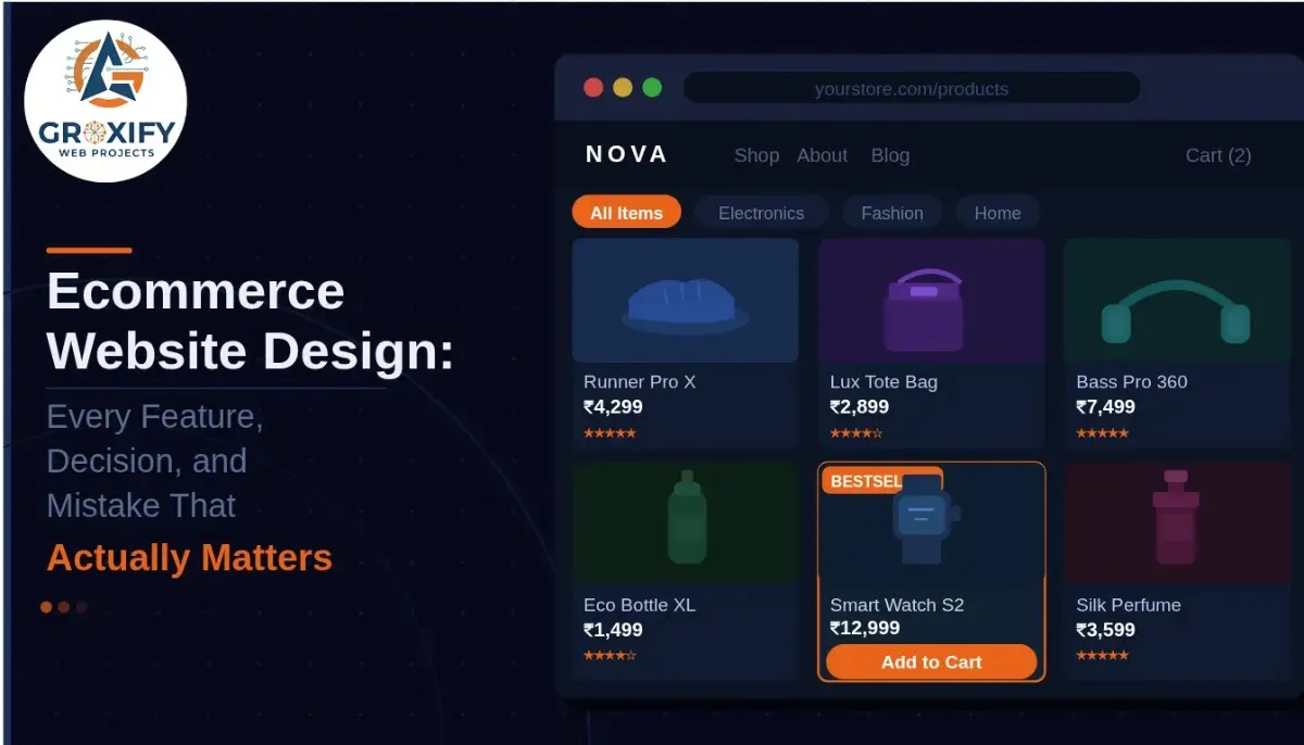
Product Pages That Do the Work of a Salesperson
This is where most stores actually lose customers, not the homepage. A product page needs to answer every question a visitor has before they think to ask it.
That means high-quality images from multiple angles, a description that addresses real purchase concerns (not just a list of specs), visible pricing, clear stock status, and an obvious “Add to Cart” button above the fold. Above the fold means visible on screen without scrolling.
Reviews belong here too. User-generated reviews, meaning real feedback from actual buyers, build trust faster than any product copy you write yourself. Do not hide them at the bottom.
A Checkout That Does Not Fight the Customer
Cart abandonment rate is the percentage of shoppers who add something to their cart and then leave without completing the purchase. Research consistently puts this number around 70 percent. A complicated or confusing checkout is one of the biggest reasons.
Keep checkout to as few steps as possible. Always offer guest checkout so people do not have to create an account before buying. Show a progress indicator so they know how close they are to done. Display security badges, which are SSL certificate icons and payment logos, clearly on the page. And never reveal unexpected shipping costs at the last step. That is one of the fastest ways to lose a sale.
Site Search That Actually Works
If your store has more than 20 products, search is not optional. A visitor who types something into your search bar is already motivated to buy. If your search returns irrelevant results or nothing at all, they go somewhere else.
Good site search includes autocomplete, which means suggestions that appear as someone types, along with filters for category, price, size, color, or whatever fits your product range. This is basic functionality that pays for itself.
Mobile Design Built First, Not Retrofitted
More than half of all ecommerce traffic currently comes from mobile devices. If your site is designed for desktop and “also works on mobile,” that is not enough anymore.
Buttons need to be large enough to tap accurately. Text must be readable without pinching and zooming. Images need to load quickly on mobile connections. Responsive design, which means your site automatically adjusts its layout to fit any screen size, is the minimum standard. The best stores think through the mobile experience separately rather than just shrinking the desktop version down.
Ecommerce Website Builder vs Custom Design: Which One Do You Actually Need
This is one of the first big decisions a new store owner faces and one where a lot of people overthink it. The honest answer is: most businesses do not need a custom-built site.
Ecommerce website builder like Shopify, WooCommerce, Wix, and Squarespace cover the vast majority of what a small to medium store needs. They handle hosting (where your site’s files live and run online), security updates, payment processing integrations, and performance automatically. You focus on your products and customers, not servers and code.
Here is a straightforward comparison:
| Builder (Shopify, Wix, etc.) | Custom Development | |
|---|---|---|
| Starting cost | Low to moderate monthly fee | High upfront investment |
| Time to launch | Days to a few weeks | Weeks to several months |
| Technical skill needed | Minimal | High, or hire a developer |
| Design flexibility | Good enough for most stores | Unlimited |
| Ongoing maintenance | Handled by the platform | Your responsibility |
| Best suited for | Most businesses | Enterprise or very specific needs |
Custom development makes sense when you need specific functionality that no builder supports, or when you are operating at a scale where monthly platform fees become more expensive than owning your own system. For most people reading this, a builder is the right and faster path.
How to Choose Ecommerce Website Templates Without Wasting Hours
Ecommerce website templates are pre-built layouts that you customize with your own content, colors, and branding. Every major platform offers dozens of them. The common trap is spending too long comparing them instead of launching.
Here is what actually matters when choosing one.
Page speed. A slow-loading template directly hurts your search rankings and drops your conversion rate. Test any template using Google’s PageSpeed Insights, which gives your site a performance score out of 100, before you commit to it.
Layout fit. Does the template’s structure actually suit what you sell? A clothing store needs different page layouts than a digital downloads store. Do not pick a template and then fight it to display your products properly.
Mobile behavior. Open the template demo on your phone before deciding. Many templates look polished on a laptop and clunky or hard to use on a small screen.
Customization without code. Can you change the layout, fonts, colors, and sections without touching any code? If not, factor in developer costs before you commit.
Free Ecommerce Website Templates: The Honest Take
Free templates work. They are not automatically lower quality. Shopify, WooCommerce, and Wix all offer free ecommerce website templates that are fast, clean, and genuinely professional.
The real difference between free and paid options usually comes down to the number of layout variations, the range of built-in sections, and a slightly more refined aesthetic in paid versions. But a free template used with thought and good content will always outperform a premium one used carelessly.
The only situation where free templates become a liability is when your niche is competitive and your site looks noticeably cheaper next to established stores. In that case, a paid template or some professional design help is worth considering.
What the Best Ecommerce Website Examples Actually Have in Common
Most articles in this space just show you a curated list of pretty stores. That does not help you build yours. What matters is understanding why the best-performing stores work, because that is what you can actually replicate.
Here is what you consistently see across high-converting ecommerce sites:
They reduce decision fatigue. Decision fatigue is what happens when too many choices exhaust a visitor and they end up choosing nothing at all. The best stores curate their homepages to feature a small selection of products. They use categories and filters to help people narrow down quickly rather than scrolling through hundreds of listings.
Social proof appears everywhere, not just on product pages. Social proof is any signal that other real people have bought from and trusted this store: reviews, star ratings, order counts, “bestseller” tags, and real customer photos. You see it on the homepage, in the cart, and near the checkout button. It is not saved for one location.
Product photography is intentional. Not necessarily expensive, but intentional. Consistent backgrounds, good lighting, multiple angles, and lifestyle shots (showing the product in real-world use) all do the same job: they help a visitor imagine owning the product. That mental shift is what converts browsers into buyers.
Speed is treated as a feature, not an afterthought. A single second of extra loading time can meaningfully drop conversion rates. The stores that perform best load fast, optimize their images, and do not load 15 third-party scripts on every page.
The checkout is almost boring. That is intentional. Simple, clean, no surprise upsells that feel like tricks, no confusing steps. Just a clear, short path from cart to order confirmation. The stores that treat checkout simplicity as a competitive advantage win.
Trust Signals That Make People Actually Buy
This is the section most ecommerce design guides skip entirely. And it is one of the most important things to get right, especially for a newer store.
A first-time visitor has never heard of you. They are taking a real risk: handing over payment details to a store they found online. Your design’s job is to prove, at every point in the experience, that you are a legitimate business.
SSL certificate. Your site must run on HTTPS, which is shown by the locked padlock icon in the browser address bar. Without it, modern browsers actively warn visitors your site is not safe. Most builders apply this automatically, but always check.
Visible contact information. A phone number, an email address, or a live chat option somewhere easy to find tells visitors a real business is behind this store. A “Contact Us” link buried in the footer is not enough.
A clear, fair return policy. Make it easy to find and plain to read. A straightforward return policy lowers purchase anxiety, which is the hesitation people feel before committing to an unfamiliar store, and it does so significantly.
Real photos of your team, workspace, or process. Not required, but powerful for smaller stores trying to build credibility fast. Stock photos of smiling people in generic offices have the opposite effect. They look fake and people know it.
Payment method logos near checkout. Showing Visa, Mastercard, UPI, PayPal, or whichever options you accept reassures visitors that their preferred payment method works and that you use legitimate processing systems.
Ecommerce Website Design Mistakes That Quietly Kill Sales
These are not dramatic errors. Nobody builds a broken checkout on purpose. But these mistakes show up constantly, even on stores that otherwise look professional.
Too many popups. One well-timed popup is manageable. Two popups within 10 seconds of landing on a page is enough for most visitors to leave immediately. Email signups, discount offers, push notification requests, and chat bubbles all competing for attention at once is too much. Pick one. Time it to appear after someone has shown genuine interest, not the moment they arrive.
No clear visual hierarchy. Visual hierarchy means the most important elements on a page draw the eye first. If your “Add to Cart” button is the same visual weight as your navigation links, that is a hierarchy problem. Important things need to look important. Contrast, size, and placement should work together to guide the visitor’s attention.
Vague product descriptions. “Premium quality” and “stylish design” say nothing and convince nobody. Tell people the dimensions, the material, the exact problem it solves, and who it is genuinely made for. Specifics are what close sales.
Images that are not optimized for web. High-resolution images uploaded without compression will slow your site down considerably. Compressing an image means reducing its file size without visibly reducing quality. There are free tools that handle this in seconds and the impact on load time is real.
No size guide, fit information, or compatibility note. For clothing, furniture, electronics, or anything where fit or function depends on the customer’s situation: if a visitor is not sure whether something will work for them, they do not buy. A simple guide or note removes that doubt at exactly the right moment.
Forcing account creation before purchase. Some visitors will create an account. Most will not bother if it stands between them and the product they want. Always offer guest checkout first and invite account creation after the order is confirmed.
A Few Words on the Right Starting Point
Before you spend anything on advertising, get the design fundamentals right. That means solid product pages, a frictionless checkout, clear trust signals, and a site that actually loads fast on mobile. These things do not require a big budget. They require intention.
The best ecommerce website design is not the most expensive or the most visually impressive. It is the one that gets out of the customer’s way and makes buying feel easy and safe. Start there.
At Groxify Web Projects, we keep coming back to this point because it is the foundation that everything else is built on. Flashy features matter a lot less than getting the basics right.
FAQ
Ecommerce website design is the process of planning and building an online store’s layout, features, and visual style so that visitors can easily find products and complete purchases. It covers everything from the homepage structure to the checkout flow and mobile experience.
Costs vary widely. A DIY store on a builder like Shopify or Wix can cost as little as a few hundred rupees or dollars per month. Hiring a designer for a custom theme typically costs more, and fully custom development can run into lakhs or thousands of dollars depending on complexity.
Not for most stores. Ecommerce website builders like Shopify, Wix, and Squarespace are built for non-technical users. You can set up a fully functional, professional-looking store without writing a single line of code. Coding only becomes necessary for advanced custom functionality.
At minimum: a homepage, product pages, a shopping cart, a checkout page, an About page, a Contact page, and a Returns or Shipping policy page. These cover the basic customer journey and the trust information visitors expect before buying.
Shopify is the better choice if you want something set up fast with minimal technical work. WooCommerce, which runs on WordPress, gives you more control and lower long-term platform costs but requires more technical comfort. If you are not confident managing hosting and plugins, start with Shopify.
Yes, for most stores. Free templates from major platforms like Shopify and Wix are fast, professional, and fully functional. The main limitation is fewer layout options compared to paid versions. A free template used well will always outperform a premium one used without thought.
When your brand positioning is premium or highly differentiated, when your products require unusual page structures that no template supports, or when you are at a scale where your site directly represents significant revenue. For early-stage stores, a builder almost always makes more sense.
A website builder like Shopify or Wix is an all-in-one hosted platform that handles everything for you. A CMS (Content Management System) like WordPress gives you more flexibility but requires you to manage hosting, security, and plugins separately. Builders are faster to start; CMS platforms offer more long-term control.
Compress all product images before uploading, choose a lightweight template, reduce the number of third-party apps or plugins installed, and use your platform’s built-in CDN (Content Delivery Network) if available. Run a free test on Google PageSpeed Insights to find exactly what is slowing you down.
Start with your product pages. Check if pricing, images, and the Add to Cart button are clear and prominent. Then review your checkout for unnecessary steps or surprise costs. Finally, look at your trust signals: is there a visible return policy, contact info, and customer reviews? Fix these before anything else.

Rohit Singh is the Founder of GROXIFY WEB PROJECTS LLP with many years of hands-on experience in digital marketing, including SEO, PPC, social media, email marketing, content writing, and WordPress development. He has worked with global clients across industries and helped businesses achieve 5x–10x revenue growth through data-driven strategies and practical execution. Rohit actively manages digital teams, builds business strategies, plans marketing systems, and oversees execution to drive consistent traffic, leads, and long-term business growth.